Friday, February 18, 2011

Pantone's Color of the Year

Several years ago, my classmates and I had to sit in on a special seminar about color and fashion. It was at 8am, barely related to my major, and I'm pretty sure I fell asleep in my chair for the majority of it, but there was one key thing I took from the lecture: The 2009 color of the year was Insomnia Yellow.
I refused to believe it. It was the most hideous color I'd ever seen. It was like neon yellow mixed with lime green and hints of brown. I immediately hated it with a passion. But without fail, it became the most popular color that year. I saw it everywhere.

-in fashion.

- in accessories

-in design

 I finally gave in and accepted it when I saw a  fashionable friend of mine owning not one, but TWO articles of clothing in that color. I silently wept inside, but gave up my fight.
I have since learned that the color was not called Insomnia (no idea where that name came from) but the much more pleasant Mimosa Yellow.
Every year, the color authority, Pantone, releases a collection of colors that they claim will be the most popular colors of the year and one color to be the Color Of The Year. Quite a title if you ask me.

The 2009 Color of the Year was Mimosa.
The 2010 Color of the Year was Turquoise.
And, fellow pink lovers rejoice, the 2011 Color of the Year is Honeysuckle.

How beautiful is that? So much more preferable to Mimosa.
In case you're curious (I was) the rest of 2011's colors (at least the spring colors) are these:

Beautiful colors, every one of them.
They're also available on Visa cards, if you love them that much. Seriously.


The undeniable point is once Pantone names a color of the year, it immediately becomes the most popular color in every field. Since not everyone will love exactly this shade of pink, the surrounding colors are generally accepted. This is probably how I ended up thinking that awful insomnia yellow was the true color of the year when it was just an off branch of Mimosa.

If Honeysuckle isn't your cup of tea, pick a shade you can live with and go with it.
The Pantone website states that they chose Honeysuckle following Turquoise to literally ward off the blues of last year. Honeysuckle is an invigorating color that will embolden us to face our everyday troubles with courage and bravery. Think of it as the pink version of power red. This is not baby nursery pink. This is a kick butt and take names kinda color.

I have collected a few pictures of Honeysuckle from various fields to prepare you for 2011.
Enjoy. :)


They even have a collection of Honeysuckle-ish yarns for me to choose from. How thoughtful.

Incorporating a new color into your wardrobe or home decor doesn't mean a total overhaul. A few key pieces are all you need. A new scarf or bracelet. A throw pillow or blanket. A bouquet of fresh flowers. Unless Mimosa, Turquoise or Honeysuckle is your favorite color, there's no need to go overboard, because you can be sure there will be a new color of the year next year.

Until next time,
xoxo.

Thursday, February 10, 2011

Two Crafts and a Snack

I have a legitimate reason for completely skipping a week of blogging:

Meet Watson, my new dog. He's a seven year old mini beagle and he's just precious. He's not yet housebroken and is quite hyperactive, so he's taken up a lot of my time these past two weeks.

To make up for it, I have a massive THREE PART BLOG! Yay!

Part One: Book Binding
I love the look of hand-bound books. They're so rustic and beautiful. I finally decided to give it a try.
All it takes to bind your own book is paper, front and back covers, a heavy thread (I chose embroidery floss) and a needle. My covers are scrapbooking paper wrapped around cardboard.

Cut the paper to be the height of the book and twice the width, then fold in half. Create mini books by folding several sheets together. This creates what's called a signature. A signature for a book like this can have anywhere from 3 to 7 sheets of paper. Less than that and it might rip. More than that and it won't close properly. You can have as many signatures as you'd like. I chose 4 signatures of 5 sheets, so my book has 40 pages since each folded sheet creates 2 pages. (80 if you want to count fronts and backs separately.)
Decide how many stitches you want holding your book together. I chose 5. Open each signature up and, in the crease, punch holes through all the papers. Make sure the holes are in the exact same place in each signature or the book won't line up correctly. I created a little template that I used when punching my holes.

The top two holes in my signatures.

Now, this is kinda cheating, I know, but I'm gonna redirect you to a video. The book binding stitch I used is called the Coptic Stitch. It's hard to explain, but easy to do and easier to learn via video. There are several great coptic stitch videos on Youtube. They do a much better job explaining the process than I would.

My completed book. I kinda love it. And it's the perfect dimensions for writing lists, my favorite.

Now, onward!

Part Two: Turning a table runner into a sweet piece of wall art.
My bedroom is shamrock green, dusty pink and dark brown. At least, I wanted it to be, but I needed a little more color. When I found a great green table runner on sale at my store, I knew I needed it for something. After thinking it over, it turned into a banner above my window.

The only problem was the ends of the runner had shamrocks on them. Clearly it's a St. Patrick's Day runner. But, no hill for a crafty climber. My solution: RIBBON!
Ribbons come in so many colors and designs that it was easy to find a few that worked with my vision.
And luckily, Michaels was having a sale on ribbons. Great find.


I laid out my runner and ironed out all the creases. (My mom would be so proud of me.) Then I had to remove all the dog hair from Watson's snooping.


By strategically laying out the ribbons, I magically made the shamrocks disappear! I played around with them for a while until I found a layout I liked.


Pup was bored of craft time. (Prepare yourself for many more Watson pictures in the future.)


Once I found a layout I liked, I took a picture of it, both for blogging and for memory when I transferred it to my wall.


I attached the runner to my wall with white thumb tacks and then tacked each end of the ribbon. It took a while, but it will leave no lasting marks on the wall or on the runner. (Other than a dozen tack holes. No big deal in the grand scheme.) And now my window wall has the perfect amount of color in just the right shades.

Part Three: Valentine's Rice Krispie Treats
Oh, you wanted a difficult snack recipe? My bad.

Coming from someone who doesn't eat chocolate, good desserts are hard to come by. Rice Krispie treats have been a standby for me for a long time. So classic. But since it's almost Valentine's Day, I decided to add a little color in the form of M&Ms. (I can handle a little chocolate.)

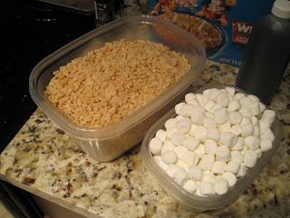
I like short ingredient lists: Rice Krispies, marshmallows, butter, vanilla flavoring and M&Ms.


6 cups of Rice Krispies and 4 cups of marshmallows. (Plus another handful to just eat.)


I melted my butter and then tossed in my marshmallows. I think melting marshmallows look so strange. (I may have tossed in a handful of french vanilla snowman-shaped marshmallows. Something's gotta counteract those M&Ms!)

Once the butter melted, I dumped in my Rice Krispies and mixed it all up. Then I threw in about a cup of Valentine's M&M's.


Once it was evenly mixed, I spread it out in a well greased 9x13 pan and let it set up. So easy and so delicious.

I never promised my crafts and recipes would always be brilliantly innovative. But who doesn't love Rice Krispie Treats? (Other than my roommate, as I just learned...)

And I will leave you with one last picture of the pup... trying to help me make the bed...

Until next time... Happy Valentine's Day!