My dear friend Kendel recently pointed out to me my love of 1950s' design. She's completely right. I mean, check out my sweet new header. I love almost all things with a retro, 1950s'/early 1960s' style.
This oven in certainly unique. I think we determined it to be from 1962. Rather than downplay the obviously dated appliances, we decided to focus on them and create a retro futuristic feeling in the kitchen. How space-age do those dials look?
To get an idea of what a kitchen of the future looked like back in 1962, I did a little research.
Retro Futurism is essentially the future as seen from the past. It's the 1950s' and 60s' predictions of the future. (There's a lot more to it than that, but I'm going for feeling, not for accuracy.)
From a design aspect, Retro-Futurism is present in a lot of famous sights.
Seattle's Space Needle is also in the same space-age style. The top is clearly supposed to replicate a flying saucer. (Also loving that it was built for the 1962 world's fair, the same year the oven was made.)
And my personal favorite:
Walt Disney World's Tomorrowland.
The whole land is designed with clean lines and metallic colors that create a futuristic look as envisioned from the mid-century years. Its current attractions, like the Astro Orbiter, were created to resemble an intergalactic spaceport and even the restaurants and food kiosks were given names like Cosmic Ray's Starlight Cafe and Auntie Gravity's Galactic Goodies. Disney always goes all out.
Once I had filled my brain with what the past thought the future would look like, I tried to convert that to an outdated kitchen.
I couldn't love this dinette ad any more than I do.
It would appear that whites, blues, metallics, clean lines and starbursts were the keys for a retro modern kitchen.
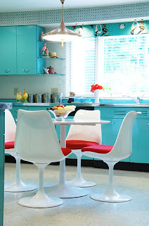
While I would have loved for our kitchen to turn out like this:
(Because I am so in love with this kitchen and those tulip chairs...)
It actually came out like this:
Oh, hi, that's me. :)
We painted the ceiling a crisp white and the walls a beautiful icy aqua blue. We got rid of all the existing kitchen accessories except for the stand mixer on the counter behind me and since we didn't actually decorate the house after we cleaned it up, it was my one little nod to retro 1950s' kitchen decor.
Given the option, I probably would have filled the kitchen with accessories like these.
I would have a hard time deciding between a classic 1950s' metallic diner-style set and an Eero Saarinen tulip table and chair set.
Luckily I didn't have to. I wonder what the renters will put in?


I’m proud to be associated with this post. I especially love the transportation concept rendering. ;)
ReplyDeleteCheck out the Frigidaire ad right before the article about the '62 World's Fair in this Life magazine: http://oldlifemagazines.com/the-1960s-1/1962/february-09-1962-life-magazine.html
ReplyDeletePink appliances!